The Dark Green Accent Wall Bedroom Trend: How to Get it Right
Thinking about a dark green accent wall for your bedroom? This trend is popular for a reason, but getting it right requires more than just paint…
This post may contain affiliate links. If you make a purchase through these links, we may earn a commission at no additional cost to you.
Bringing colour into your bedroom can totally change how it feels. While plain white or neutral walls are common, adding a bold accent colour on just one wall can create a stunning focal point. One trend that’s really popular right now is using dark green for a bedroom accent wall. It’s a fantastic choice that brings depth, calm, and a touch of nature indoors. But like any design choice, getting it right matters. It’s not just about slapping some paint on a wall; it’s about making it work with the rest of your space. This guide will walk you through everything you need to know to nail the dark green accent wall trend in your own bedroom.
Introduction: Why Dark Green is Perfect for Bedrooms
Bedrooms should be personal sanctuaries. They’re places where you relax, recharge, and escape the day’s stresses. Choosing the right colour is crucial for setting the mood. While bright colours can be energizing, they might not be the best for sleep. Darker, more muted tones often create a sense of calm and coziness. Dark green fits this perfectly. It’s a colour deeply connected to nature, and bringing elements of nature indoors has been shown to have positive effects on our well-being.
The Psychology of Green in Design
Colours aren’t just visual; they affect our emotions and even our bodies. This is the basis of colour psychology in design. Green, in general, is widely seen as a restful and calming colour. It reminds us of trees, plants, and natural landscapes, which we often associate with peace and growth. Studies have suggested that looking at green can reduce eye strain and even lower heart rate.
When we talk about dark green, we add another layer. Deeper shades of green retain that calming effect but also introduce a sense of sophistication, depth, and security. Think of a deep forest – it feels ancient, grounded, and quiet. Using dark green in a bedroom can evoke similar feelings, making the space feel like a secure, peaceful retreat. It’s less energetic than a bright apple green and more grounding.
The Appeal of Dark, Moody Colours in Bedrooms
For a long time, bright, airy bedrooms were the standard. And they still have their place! But there’s been a growing appreciation for darker, moodier palettes in bedrooms. These colours, including deep blues, charcoals, and yes, dark greens, can make a large room feel more intimate and a regular-sized room feel incredibly cozy. They absorb light rather than reflecting it, which helps create that snug, den-like atmosphere that’s perfect for winding down at night.
A bedroom painted in a dark, rich colour can feel incredibly luxurious and enveloping. It provides a dramatic backdrop that allows lighter elements – like crisp white bedding or metallic decor – to really pop. While painting an entire room a dark colour can be intense, using it on just one wall gives you the benefits of the moody trend without making the room feel overwhelmingly dark or small.
Why an Accent Wall? Focusing Impact
So why choose just one wall instead of painting the whole room dark green? An accent wall is a strategic design choice. It allows you to introduce a bold colour or pattern without committing to it everywhere. This is especially useful with intense or dark colours like forest green. Painting one wall creates a focal point – a specific area that your eye is drawn to when you enter the room.
In a bedroom, the accent wall is often the wall behind the bed. This makes the bed the central focus of the room, highlighting the most important piece of furniture. It also means you typically don’t see the dark wall first thing in the morning, which some people prefer. Using an accent wall also saves on paint and effort compared to painting the whole room. It’s a relatively low-risk way to experiment with a dramatic colour and see how it feels in your space. It provides that punch of colour and mood without making the room feel cave-like.
Choosing Your Perfect Dark Green Shade
Not all dark greens are created equal. Just like there’s a difference between sky blue and navy blue, there’s a wide spectrum within the “dark green” category. The specific shade you choose will significantly impact the mood and style of your bedroom. Thinking about the subtle differences in undertones and depth is key to finding the dark green that’s just right for you.
Exploring the Spectrum of Dark Greens
Dark green shades can range from very deep, almost black-greens to slightly lighter, earthier tones. Understanding these variations helps you narrow down your options.
Forest Green: Deep and Natural
Forest green is perhaps the most classic dark green. It’s a deep, rich shade reminiscent of dense woods. Think of the colour of pine trees or moss in a shaded forest. Forest green often has subtle blue or black undertones, which contribute to its depth and intensity.
Using forest green creates a strong connection to nature. It feels grounding, stable, and somewhat traditional, though it can also look quite modern depending on the context. It’s a deeply absorbing colour that works well for creating a cozy, intimate feel. Paint colours labeled “Forest Green,” “Deep Woods,” or “Emerald Forest” often fall into this category.
Emerald Green: Jewel-Toned Luxury
Emerald green is a brighter, more vibrant dark green compared to forest green. It’s named after the precious gemstone and typically has clearer, more saturated green pigment. While still dark, it can feel more lively and luxurious than forest green.
Emerald green often has slightly yellow or clear green undertones, giving it that jewel-like brilliance. It works well for creating a space that feels sophisticated and opulent. If you want your dark green accent wall to feel less muted and a bit more glamorous, emerald green is an excellent choice. Look for paint names like “Emerald Isle,” “Jewel Green,” or “Deep Jade.”
Hunter Green: Classic and Stately
Hunter green is similar to forest green but is often described as having a slightly more muted or desaturated quality. It’s a deep, classic green that feels strong and reliable. Historically associated with hunting attire, it has a timeless, somewhat stately feel.
Hunter green can have subtle grey or black undertones, making it feel slightly less vibrant than forest or emerald green. It’s a solid, dependable choice that provides a strong backdrop without being overly dramatic. Paint names like “Hunter Green,” “British Racing Green,” or “Classic Green” might fit this description.
Olive Green: Earthy and Muted
Olive green is a dark green with significant yellow and brown undertones. This gives it an earthy, sometimes slightly khaki-like appearance. It’s a more muted and naturalistic dark green compared to the richer forest or emerald shades.
Olive green feels grounded, organic, and slightly rustic or vintage. It pairs beautifully with other earth tones, wood, and natural textures. If you prefer a dark green that feels softer, more muted, and less intense than a pure forest or emerald, olive green could be the perfect fit. Paint names like “Olive Grove,” “Deep Moss,” or “Military Green” might be in this family.
Teal (Dark Green-Blue): Rich and Complex
While technically a green-blue, dark teal often reads as a dark green with strong blue undertones. It’s a deep, complex colour that can shift depending on the light, sometimes appearing more green, sometimes more blue.
Dark teal is sophisticated, calming, and can feel both modern and classic. The blue undertones add an extra layer of depth and tranquility. It pairs exceptionally well with metallics and rich textures. If you’re drawn to dark green but also love the calming quality of blue, dark teal offers a beautiful compromise. Look for colours named “Deep Teal,” “Peacock Green,” or “Petrol.”
Factors to Consider When Selecting Your Shade
Choosing the right shade isn’t just about picking the one you like best on a paint chip. Several factors in your room will influence how the colour looks and feels on the wall.
Room Size and Light Levels
The amount of natural and artificial light your bedroom receives is perhaps the biggest factor. Dark colours absorb light. In a room with very little natural light, a deep forest green can make the space feel smaller and potentially too dark if not balanced correctly.
If you have a small room or limited light, consider a dark green that leans slightly lighter or has clearer undertones, like an emerald green, or balance a deep forest green with plenty of lighter colours and reflective surfaces elsewhere. In a large room with lots of natural light, you have more freedom to go with a very deep, absorbing shade like a true forest green or even a green-black. Always look at paint samples on your wall in different lights throughout the day before committing.
Existing Decor and Colour Palette
Your dark green accent wall needs to work with the colours and styles already present in your bedroom, or the ones you plan to introduce. Think about the colours in your bedding, furniture, curtains, and artwork.
If your room already features warm tones like beige, brown, or terracotta, an olive green or a forest green with brown undertones might blend seamlessly. If you have cooler tones like grey or blue, a dark green with blue undertones (like teal) or a crisp hunter green could be a better match. Consider the “temperature” of your existing colours – are they warm or cool? Try to pick a dark green that complements that temperature or provides a deliberate, pleasing contrast.
Desired Mood and Style
What feeling do you want your bedroom to have? Do you want it to feel like a cozy cabin retreat (hunter or forest green)? A luxurious boutique hotel (emerald or deep teal)? A calm, earthy haven (olive green)?
The specific shade of dark green you choose is a powerful tool for setting this mood. Deeper, more muted shades tend to feel more traditional or cozy, while brighter, clearer dark greens can feel more modern or glamorous. Think about the overall aesthetic you are aiming for and select a shade that supports that vision.
Where to Put Your Dark Green Accent Wall
Once you’ve chosen your perfect shade of dark green, you need to decide which wall will get the special treatment. While there’s no strict rule, some walls work better as accent walls than others. The goal is usually to highlight a specific area or architectural feature and create a focal point in the room.
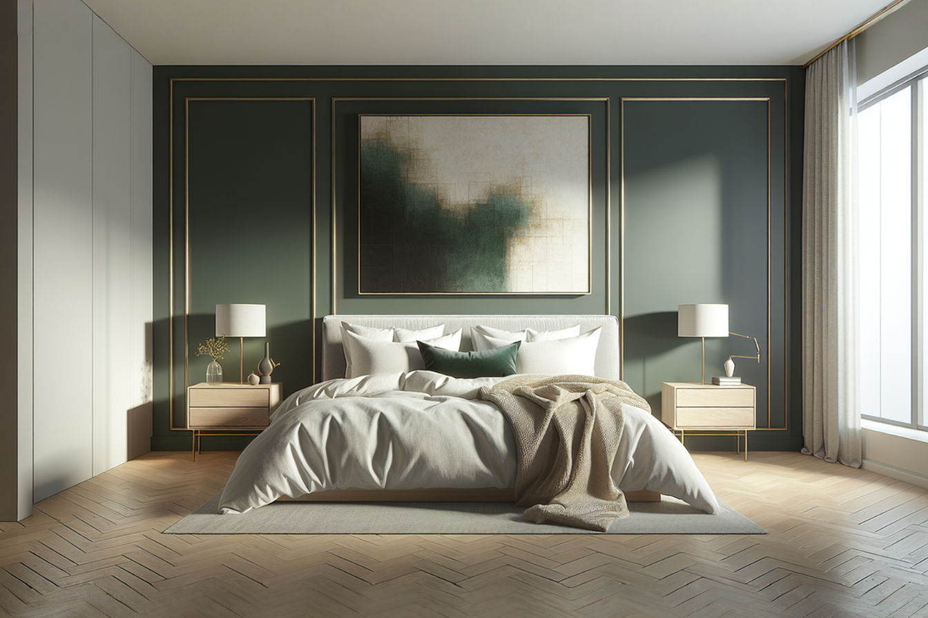
The Bed Wall: A Classic and Effective Choice
Painting the wall behind your bed is arguably the most popular choice for an accent wall, especially in a bedroom. This wall is naturally the focal point because the bed is the largest and most important piece of furniture.
- Pros: It immediately draws the eye to the bed, making it feel like the star of the room. It provides a beautiful backdrop for your headboard and bedding. Since it’s often the last thing you see before sleeping and the first thing you see upon waking (depending on room layout), painting this wall can create a calming atmosphere without feeling overwhelming when you’re simply relaxing in the room during the day. It also helps to visually anchor the bed in the space.
- Cons: If your bed isn’t centered or the wall has awkward features (like off-center windows), it might not be the best choice.
The Wall Opposite the Bed: Drawing the Eye
Another strong option is the wall directly opposite the bed. This is the wall you face when you are lying in bed.
- Pros: It provides a dramatic view from the bed and can make the room feel more dynamic. If this wall has an interesting feature like a fireplace, a large window with a view, or a built-in bookshelf, painting it dark green can highlight this feature. It can also make the room feel larger by drawing the eye deeper into the space.
- Cons: A large expanse of dark colour constantly in your view might not feel as restful for some people as having the accent wall behind you. It can also make items placed against this wall (like a dresser or desk) stand out more, which requires careful styling.
A Wall with Architectural Interest: Highlighting Features
Sometimes, the best wall for an accent isn’t necessarily the bed wall or the opposite wall. It could be a wall with a unique architectural feature you want to emphasize.
- Examples: A wall with a fireplace, built-in shelving, an interesting alcove, or unique molding. Painting this wall dark green can make that feature really stand out and become the main attraction of the room.
- Pros: It highlights interesting aspects of your room’s structure, giving it character. It can be a great solution if the bed wall isn’t suitable for an accent.
- Cons: If the feature is off-center or competes with the bed for attention, it might make the room feel unbalanced.
Considering the Room’s Layout and Focal Points
Ultimately, the best wall depends on your specific bedroom layout and what you want to emphasize. Walk into your room and think about where your eye naturally goes. What wall makes the most sense to highlight?
- Consider door and window placement: An accent wall often works best on a solid wall without too many interruptions. A wall with a large window can work, but the paint might be less impactful. A wall with a door or multiple doorways might break up the colour too much.
- Consider furniture arrangement: Where is your largest furniture placed? Does the wall you’re considering allow the accent colour to frame or enhance a key piece like your bed or a beautiful dresser?
- Consider the room’s purpose: While primarily a bedroom, maybe you have a reading nook or a small desk area. Could the accent wall help define one of these zones?
Thinking through these points will help you choose the wall that maximizes the impact of your beautiful dark green paint.
Preparing Your Wall for Painting
Painting a wall isn’t just about opening a can of paint and getting started. Proper preparation is crucial for a smooth, professional-looking finish, especially when using a dark colour like deep green, which can show imperfections more easily than lighter shades. Skipping these steps often leads to a frustrating result.
Cleaning and Repairing the Surface
Before any paint goes on, the wall needs to be clean and smooth. Any dirt, grease, or imperfections will show through the new paint, ruining the effect of your dark green accent wall.
Washing the Wall
Start by washing the wall. Dust and grime build up over time, even in a bedroom. Use a mild all-purpose cleaner mixed with water. Dip a sponge or cloth into the solution, wring it out well (you don’t want the wall to get too wet), and wipe down the entire surface. Pay extra attention to areas around light switches, outlets, or where furniture might have rubbed against the wall, as these spots tend to be dirtier or greasier. Rinse the wall with a clean, damp cloth. Allow the wall to dry completely before moving on. This usually takes a few hours, depending on humidity.
Filling Holes and Cracks
Most walls have small nail holes from hanging pictures or minor dents and cracks. These will be very noticeable under a dark paint. Fill any holes or cracks using spackle or joint compound. For small nail holes, a lightweight spackle is easiest. Use a putty knife to apply a small amount of spackle, pressing it firmly into the hole. Scrape away any excess so the spackle is flush with the wall surface. For larger cracks or holes, you might need to apply spackle in layers, allowing each layer to dry before adding the next. Follow the product instructions for drying times.
Sanding and Smoothing
Once the spackle is completely dry, it needs to be sanded smooth. Use fine-grit sandpaper (around 120-grit to 220-grit is usually sufficient) to gently sand the patched areas until they are smooth and level with the rest of the wall. You want to remove any bumps or ridges from the spackle. Sanding also helps the primer and paint adhere better. After sanding, wipe down the wall again with a slightly damp cloth or use a tack cloth to remove all sanding dust. Dust left on the wall will cause bumps in your paint finish.
Priming for Success: Why It Matters
Priming is a step many people want to skip, but it’s especially important when painting a dark colour, and absolutely essential if you are painting a dark colour over a lighter one or covering stains. Primer creates a uniform surface for the paint to adhere to, improves paint coverage (meaning you’ll need fewer coats of your dark green paint), and helps block stains or previous colours from showing through.
Choosing the Right Primer (Tinted vs. Untinted)
For dark colours like deep green, using a tinted primer is highly recommended. A standard white primer requires the dark green paint to do a lot of work covering the white background. A tinted primer, specifically one tinted grey or a dark shade similar to your green, makes the transition much easier.
- Standard White Primer: Good for covering minor imperfections and providing a base, but requires more coats of dark paint to achieve full opacity over a light wall.
- Tinted Primer (Grey or Dark): Provides a closer base colour to your final paint, drastically improving the coverage of the dark green. This means you’ll likely need only two coats of your expensive dark green paint instead of three or four, saving you time and money. Ask your paint store to tint the primer towards your chosen dark green shade.
Applying Primer Evenly
Apply the primer just like you would paint, using a roller for the main wall area and a brush for cutting in edges. Ensure you apply a thin, even coat. Avoid applying it too thickly, as this can lead to drips or uneven texture. Allow the primer to dry completely according to the manufacturer’s instructions. This is often 2-4 hours, but some primers require longer. Proper drying time is crucial for the primer to do its job effectively.
Taping and Protecting Surfaces
Before you start painting your final colour, protect everything you don’t want to get paint on. This includes trim, baseboards, the ceiling edge, door frames, and the floor.
Use painter’s tape to create clean lines along the edges of the wall where it meets the ceiling and adjacent walls, and along the baseboards and door frames. Press the tape down firmly with a putty knife or your finger to ensure a tight seal and prevent paint bleed. Cover the floor with drop cloths – old sheets, plastic sheeting, or dedicated painter’s drop cloths work. If you’re painting near furniture you can’t move, cover it completely with plastic sheeting. Taking the time to tape and cover properly will save you a lot of cleanup later.
Painting Your Dark Green Accent Wall
With the wall prepped and protected, you’re ready for the exciting part: applying the dark green paint! The finish you choose and the painting technique you use will significantly impact the final look of your accent wall.
Choosing the Right Paint Finish
Paint finishes, also known as sheens, range from flat (no shine) to high-gloss (very shiny). The finish affects how durable the paint is, how washable it is, and how much light it reflects.
Matte or Flat: Hiding Imperfections, Absorbing Light
- Description: This finish has the least amount of shine. It absorbs light rather than reflecting it.
- Pros: Flat paint is excellent at hiding minor wall imperfections, such as patched areas or slightly uneven texture. It provides a rich, deep, non-reflective look, which is often desired with dark, moody colours like deep green. It gives a sophisticated, velvety appearance.
- Cons: It’s the least durable and most difficult to clean finish. Wiping it down can sometimes scuff the surface. It’s best for low-traffic areas or on walls that won’t be touched frequently.
- Technical Detail: Flat paint contains a higher proportion of pigment volume solids (PVC) relative to binder compared to higher sheens. The rougher surface texture scatters light, reducing gloss.
Eggshell or Satin: Durable and Slightly Reflective
- Description: Eggshell has a very slight sheen, similar to an eggshell. Satin is slightly more reflective than eggshell, with a smoother, more polished look.
- Pros: These finishes offer more durability and washability than flat paint, making them suitable for most bedroom walls. They still hide imperfections reasonably well, though not as effectively as flat. They reflect a small amount of light, which can add a subtle dimension to the dark green. Satin is often used in higher-moisture areas like bathrooms, but can be a good choice for bedrooms too.
- Cons: They will show imperfections more than flat paint, so good wall prep is essential.
- Technical Detail: Eggshell and satin finishes have a lower PVC than flat paint. The increased binder creates a smoother surface that reflects more light. Satin typically has a higher percentage of gloss (usually 7-15% gloss) than eggshell (usually 3-7% gloss).
Semi-Gloss or Gloss: High Durability, Reflective, Highlights Imperfections
- Description: These finishes are quite shiny and highly reflective. Semi-gloss is commonly used for trim; gloss is very shiny and durable.
- Pros: They are the most durable and easiest to clean finishes.
- Cons: They will highlight every single imperfection on the wall – every bump, divot, or uneven patch will be clearly visible. They are also highly reflective, which might be distracting on a large accent wall, especially with a dark colour.
- Technical Detail: These finishes have the lowest PVC and the highest binder content. The very smooth, hard surface acts like a mirror, reflecting light directly back at the viewer. Semi-gloss usually has 35-45% gloss, while gloss is over 70%.
For a dark green accent wall in a bedroom, a matte or eggshell finish is usually the best choice. Matte gives that rich, velvety, sophisticated look and hides minor flaws. Eggshell offers a bit more durability without being too shiny. Avoid semi-gloss or gloss on the main wall surface; save those for trim if you want a contrasting finish there.
Techniques for a Flawless Finish
Applying the paint correctly is just as important as the preparation and paint choice.
Using Rollers and Brushes Effectively
- Brushes: Use a high-quality angled brush for “cutting in” – painting the edges where the wall meets the ceiling, adjacent walls, and trim. Dip the brush about a third of the way into the paint, tap off excess, and use steady strokes to create a clean line. Hold the brush like a pencil for control.
- Rollers: Use a roller with the appropriate nap (the thickness of the roller cover) for your wall surface. A 3/8-inch nap is good for smooth or lightly textured walls. A thicker nap (1/2-inch or 3/4-inch) is needed for heavily textured walls. Load the roller evenly with paint from the tray, avoiding overloading it. Roll the paint onto the wall in a “W” or “M” pattern, then fill in the gaps. Work in sections, overlapping slightly with the previously painted area to avoid roller marks. Maintain a wet edge – meaning don’t let the paint on the wall dry too much before you roll the next section, or you’ll get lines.
Applying Multiple Coats
Dark colours almost always require at least two coats for full, even coverage. The first coat will likely look patchy, especially over a lighter primer or wall. This is normal. Allow the first coat to dry completely according to the paint manufacturer’s instructions before applying the second coat. 1 Applying a second coat too soon can lift the first coat or cause an uneven finish. Two thin, even coats are always better than one thick coat. If covering a very light wall or using a standard primer, you might even need a third coat to achieve perfect opacity and depth of colour.
1. Complete Guide: How To Paint A Brick Fireplace Like a Pro
Cutting In Cleanly
Cutting in requires a steady hand. Paint along the edge of the wall, extending the brush slightly onto the adjacent surface (ceiling, trim). Then, use the roller to come as close as possible to the cut-in line without actually touching the ceiling or trim. This blends the brushed area with the rolled area, preventing visible brush strokes in the main part of the wall. Professional painters often use a technique called “laying off,” where they do the cutting in and then immediately follow with the roller, blending as they go. Practicing on a piece of cardboard or scrap drywall first can be helpful if you’re new to cutting in.
Complementing Your Dark Green Accent Wall
Painting the wall is only the first step. To make your dark green accent wall truly shine, you need to carefully consider the other elements in the room – the colours on the remaining walls, the furniture, textiles, lighting, and decor. These elements should work together to create a harmonious and inviting space.
Colour Palettes That Sing with Dark Green
The colours you use on the other walls and in your decor will greatly influence the overall feel of the room. Dark green is surprisingly versatile and pairs well with a variety of palettes.
Neutrals: White, Cream, Beige, Grey
This is the safest and most classic approach. Painting the other three walls in a neutral colour allows the dark green accent wall to be the undisputed star.
- White/Off-White: Creates a crisp, clean contrast. It keeps the room feeling bright and airy despite the dark accent wall. Works well with forest or emerald green for a modern or classic look.
- Cream/Beige: Offers a softer, warmer contrast than white. Cream or beige walls make the dark green feel cozier and more traditional or earthy. Pairs beautifully with olive green or a slightly warmer forest green.
- Grey: Depending on the shade (light, medium, charcoal) and undertones (warm or cool), grey can create a sophisticated and modern look. Light grey walls keep the room feeling bright. Charcoal grey can enhance the moody vibe while still providing separation from the dark green. Cool greys work well with dark greens that have blue undertones (like teal), while warm greys can pair with earthier greens.
Earth Tones: Terracotta, Browns, Muted Oranges
To enhance the natural, grounded feel of dark green, pair it with other earth tones.
- Terracotta: This warm, reddish-brown colour creates a beautiful, organic contrast with dark green, reminiscent of potted plants and natural landscapes. Use it in textiles, pottery, or small decor items.
- Browns: Various shades of brown, from light tan to deep chocolate, work wonderfully with dark green. Think of wood tones, leather, or brown textiles. This creates a rich, layered, nature-inspired palette.
- Muted Oranges/Rust: A burnt orange or rust colour provides a warm, energetic contrast to the cool depth of dark green. Use it in pillows, throws, or artwork to add a pop of colour that feels natural and inviting.
Metallic Accents: Gold, Brass, Copper
Metallics add a touch of glamour and sophistication that pops against the matte depth of dark green.
- Gold/Brass: Warm metallics like gold and brass add a sense of luxury and warmth. They reflect light beautifully, providing a bright counterpoint to the dark wall. Use them in light fixtures, hardware (drawer pulls, curtain rods), picture frames, or decorative objects. This pairing feels particularly rich with emerald or forest green.
- Copper: Copper offers a warmer, slightly more rustic metallic feel. It works well with earthy greens like olive or forest green, adding a touch of organic warmth.
Wood Tones: Light to Dark Woods
Wood is a natural companion to dark green, reinforcing the connection to nature.
- Light Woods: Light oak, birch, or maple furniture or flooring keeps the room feeling bright and provides a gentle contrast to the dark wall. This works well in modern or Scandinavian-inspired spaces.
- Medium Woods: Cherry or walnut tones add warmth and a classic feel. They create a comfortable, inviting atmosphere.
- Dark Woods: Mahogany or dark-stained wood furniture creates a dramatic, rich look that enhances the moody feel of the dark green wall.
Pops of Colour: Mustard Yellow, Blush Pink, Deep Berry
If you want to add more vibrant energy, a few strategic pops of colour can work beautifully against a dark green backdrop.
- Mustard Yellow: This warm, earthy yellow provides a vibrant contrast that feels both retro and modern. Use it in pillows, a throw blanket, or a piece of artwork.
- Blush Pink: Soft, dusty pink adds a touch of gentle, romantic contrast. It prevents the dark green from feeling too serious and introduces a bit of softness.
- Deep Berry/Burgundy: These rich, deep red-purple tones create a sophisticated and luxurious colour scheme with dark green. Use them sparingly in textiles or small accessories.
Selecting Trim and Door Colours
Don’t forget the trim around your dark green accent wall! This includes baseboards, door frames, window frames, and crown molding if you have it. The colour you choose for the trim can dramatically change the look and feel.
Crisp White: A Classic Contrast
Painting the trim a crisp white is the most traditional and popular choice. It provides a clean, sharp contrast that makes the dark green wall pop. This look is clean, timeless, and works well in most styles. It makes the dark green feel even deeper and richer by comparison.
Off-Whites and Creams: Softer Definition
If crisp white feels too stark, off-whites or creams offer a softer separation between the wall and the trim. This creates a slightly warmer, more subtle look that can feel more relaxed or traditional, especially with warmer shades of dark green like olive.
Matching or Deeper Greens: A Monochromatic Feel
For a bolder, more enveloping look, you could paint the trim the same dark green as the wall, or use a slightly deeper or lighter shade from the same colour family. This creates a monochromatic effect where the wall and trim blend together, making the wall appear more seamless and the colour more immersive. Use different paint finishes (e.g., matte on the wall, semi-gloss on the trim) to provide subtle definition through sheen.
Natural Wood Tones: Rustic Charm
If you have beautiful natural wood trim, consider leaving it unpainted or staining it to bring out the wood grain. This provides a rustic, warm contrast to the dark green, enhancing a nature-inspired or traditional style.
Decorating Your Bedroom Around the Accent Wall
With the paint dry and the complementing colours chosen, it’s time to furnish and decorate the room. The furniture, textiles, lighting, and accessories you select will layer onto the foundation you’ve created with the dark green wall, bringing the whole look together.
Furniture Choices That Enhance Dark Green
The style and material of your furniture should work in harmony with the mood set by the dark green wall.
Wood Furniture: Warmth and Texture
As mentioned in the colour palettes, wood is a natural fit. A beautiful wooden bed frame, dresser, or nightstands add warmth, texture, and a grounding element. Light woods keep the space feeling open, while dark woods enhance the moody, sophisticated vibe. Reclaimed wood can add a rustic touch that pairs well with earthy greens.
Upholstered Beds and Headboards: Adding Softness
An upholstered bed or headboard adds softness and can introduce another colour or texture. A headboard in a neutral linen, a rich velvet (perhaps in a complementary colour like navy, gold, or blush), or even a patterned fabric can stand out beautifully against the dark green backdrop. The texture of the upholstery provides a tactile contrast to the smooth painted wall.
Metallic Furniture Details: A Touch of Glamour
Furniture with metallic accents – like brass legs on a dresser, gold pulls on nightstands, or a metal bed frame – tie in with the metallic accents you might use in your decor. These small details add a touch of polish and reflect light, preventing the dark wall from feeling too heavy.
Textiles: Bringing in Texture and Colour
Textiles are your opportunity to layer in colour, pattern, and texture, making the bedroom feel comfortable and inviting.
Bedding: Layering and Colour Coordination
Your bedding is a large surface area and a key element in the room’s colour scheme.
- Neutrals: Crisp white, cream, or light grey bedding looks incredibly clean and fresh against a dark green wall. It creates a hotel-like feel and keeps the focus on the wall colour.
- Warm Tones: Bedding in warm neutrals like beige, taupe, or soft brown enhances the cozy feel.
- Pops of Colour: Introduce duvet covers, quilts, or throw pillows in complementary colours like mustard yellow, blush pink, terracotta, or deep berry to add personality and vibrancy.
- Texture: Layering different textures in your bedding (cotton, linen, velvet, chunky knits) adds visual interest and makes the bed look more inviting.
Curtains: Framing the Wall and Controlling Light
Curtains serve a practical purpose (blocking light for sleep) but are also a major design element.
- Neutrals: Neutral curtains (white, cream, grey, beige) keep the focus on the accent wall.
- Matching/Complementary Colours: Curtains in a shade of green similar to the accent wall, or in a complementary colour from your palette (e.g., blush pink, mustard yellow), can create a more cohesive or dramatic look.
- Fabric: Choose a fabric weight that suits your needs (blackout curtains for total darkness, sheer curtains for diffused light). The texture of the fabric (velvet, linen, cotton) also adds to the room’s feel. If the accent wall is dark and moody, consider curtains with some texture or subtle sheen to add dimension. Hanging curtains high and wide makes the window appear larger and allows the maximum amount of natural light when open.
Rugs: Anchoring the Space and Adding Comfort
A rug can anchor the furniture arrangement (especially the bed) and add colour, pattern, and softness underfoot.
- Neutrals: A large neutral rug (jute, sisal, or wool in beige, grey, or cream) provides a grounding base without competing with the accent wall.
- Colour/Pattern: A rug in a complementary colour or with a subtle pattern can introduce more visual interest. Just make sure the colours in the rug coordinate with your overall palette.
Throw Pillows and Blankets: Adding Pops of Colour and Texture
These are easy and relatively inexpensive ways to layer in colour, texture, and comfort. Use throw pillows and blankets in your chosen accent colours (mustard, blush, berry, terracotta) and various textures (velvet, faux fur, chunky knit, embroidered) to make the bed or a reading chair extra inviting.
Lighting: Illuminating Your Dark Green Wall
Lighting is critical in a room with a dark accent wall. Dark colours absorb light, so you need careful planning to ensure the room doesn’t feel dim or gloomy. Layered lighting is key.
Layered Lighting: Ambient, Task, and Accent
Good lighting design involves three types of lighting:
- Ambient Lighting: This is the main, general light source for the room (like a ceiling fixture). It provides overall illumination. A dimmer switch is a great addition to control the intensity and set a relaxed mood.
- Task Lighting: This is focused light for specific activities (like reading lamps on nightstands or a floor lamp near a chair). It provides necessary brightness where you need it.
- Accent Lighting: This is directional lighting used to highlight specific features, like artwork on the dark green wall or the texture of the wall itself. Small spotlights or picture lights can draw attention to elements on the accent wall.
Ensure you have a good mix of these lighting types to provide flexibility and prevent dark corners.
Fixture Styles: Matching the Room’s Mood
The style of your light fixtures contributes to the overall aesthetic.
- Modern: Clean lines, minimalist designs, metallic finishes (black, chrome, brass).
- Traditional: More ornate designs, classic materials, fabric shades.
- Rustic: Fixtures made of wood, wrought iron, or with industrial elements.
- Glamorous: Chandeliers, fixtures with crystals, polished metallic finishes.
Choose fixtures that complement the style you’ve created with your dark green wall and other decor. Metallic fixtures in gold, brass, or copper can look stunning against dark green.
Bulb Colour Temperature: Warm vs. Cool Light
The colour temperature of your light bulbs is important. It’s measured in Kelvins (K).
- Warm White (around 2700K – 3000K): This light has a yellowish tone, similar to incandescent bulbs. It feels cozy, inviting, and relaxing – perfect for a bedroom. It enhances the richness of dark colours.
- Cool White (around 4000K): This light is whiter and brighter. It’s good for task lighting (like in a kitchen or office) but can feel harsh and less relaxing in a bedroom.
- Daylight (5000K and up): This light is very blue-white, mimicking natural daylight. It can make colours appear truer but is generally too stimulating for a bedroom environment.
Stick to warm white bulbs (2700K-3000K) in your bedroom lighting to maintain that cozy, relaxed atmosphere. This warm light also looks beautiful reflecting off the dark green paint.
Wall Decor and Accessories
What you hang on and place near your dark green accent wall can either enhance it or detract from it.
Artwork: Choosing Pieces That Stand Out
The dark green wall provides a dramatic gallery-like backdrop for artwork. Choose pieces with frames or colours that pop against the green.
- Metallic Frames: Gold, brass, or silver frames look stunning and add a touch of elegance.
- White Frames/Mats: Create a clean, modern look that makes the artwork stand out.
- Complementary Colours: Artwork featuring colours like orange, pink, yellow, or even contrasting blues will look vibrant against the dark green.
- Subject Matter: Art depicting nature scenes (forests, plants, landscapes) can reinforce the natural feel of the green. Abstract art can add a modern edge.
Consider the size of the artwork. A large single piece can make a bold statement, or a gallery wall of smaller pieces can add visual interest and personality.
Mirrors: Reflecting Light and the Accent Colour
Mirrors are excellent for making a room feel larger and brighter because they reflect light. Placing a mirror on or opposite the dark green accent wall will reflect the beautiful colour into the room and help distribute light. A mirror with a metallic frame (gold, brass) can be particularly effective.
Shelving: Displaying Items
Floating shelves or a bookshelf against the dark green wall provide space to display decorative objects, books, or plants. Choose shelves in a material or colour that contrasts nicely with the green (e.g., natural wood, white, or black). Arrange items carefully, using objects with different heights, textures, and colours that complement your palette. Adding some live plants or greenery on the shelves or elsewhere in the room will reinforce the natural theme and look great against the dark green.
Practical Considerations and Troubleshooting
While a dark green accent wall can be stunning, there are a few potential challenges to consider, particularly regarding room size and light.
Making a Small Room Feel Larger
Dark colours can sometimes make a room feel smaller because they absorb light and make walls appear to recede. However, you can still use a dark green accent wall in a small bedroom if you balance it correctly.
Using Light Colours on Other Walls
This is the most important strategy. Paint the remaining three walls in a light, reflective colour like crisp white, off-white, or a very light grey. These light colours will reflect light, keeping the majority of the room feeling bright and open.
Strategic Mirror Placement
Place mirrors strategically to reflect light and create the illusion of more space. A large mirror on a wall adjacent to or opposite the dark green wall will reflect the light colours and make the room feel wider or longer.
Appropriate Lighting
Ensure you have ample layered lighting, as discussed earlier. Good illumination is key to preventing a small room with a dark wall from feeling dim or cramped. Use multiple light sources to brighten all corners of the room.
Minimizing Clutter
In a small room, clutter makes the space feel smaller and more chaotic. Keep the areas near the dark accent wall tidy and organized. Choose furniture with storage solutions to help keep things put away.
Preventing the Room from Feeling Too Dark
Even in a larger room, a dark green accent wall, if not balanced, can make the space feel darker than desired.
Maximizing Natural Light
Keep window treatments minimal or choose curtains that can be pulled back completely during the day to let in as much natural light as possible. Avoid heavy, dark drapes on windows near the accent wall if you’re concerned about darkness.
Adding Ample Artificial Light
Ensure you have multiple sources of artificial light. Relying on just one overhead light fixture won’t be enough to illuminate the room properly and will likely leave corners feeling dark. Use a combination of ceiling lights, lamps (table lamps, floor lamps), and possibly accent lighting.
Using Reflective Surfaces
Incorporate elements that reflect light. This includes mirrors (as mentioned), but also items with glossy or metallic finishes. Picture frames, lamps, decorative objects, and even furniture details can help bounce light around the room.
Balancing with Lighter Colours
As with small rooms, using lighter colours on the other walls, ceiling, and in your textiles and decor is crucial. A dark wall needs lighter elements elsewhere to provide balance and keep the room from feeling heavy or gloomy.
Dealing with Awkward Room Shapes or Features
If your bedroom has an unusual shape, sloped ceilings, multiple doorways, or other awkward features, deciding on an accent wall might be trickier.
- Sloped Ceilings: Painting a sloped wall dark green can create a cozy, den-like feel, but it might also make the ceiling feel lower. Consider painting only the vertical portion of the wall or carefully evaluate how the dark colour will interact with the angle.
- Multiple Doorways/Windows: Avoid making a wall with many breaks (doorways, windows) your accent wall, as the colour’s impact will be diminished. Choose a solid wall if possible.
- Alcoves/Nooks: A small alcove or a specific reading nook can be a perfect spot for a dark green accent colour. It defines the zone and adds a cozy feel without committing to a whole wall.
Sometimes, in a room with complex architecture, a single bold colour on one carefully chosen wall can actually help simplify the visual chaos and provide a clear focal point.
Maintaining Your Accent Wall
Once your beautiful dark green accent wall is complete, a little care will keep it looking fresh for years to come.
Cleaning Painted Walls
The ease of cleaning depends heavily on the paint finish you chose.
- Flat/Matte: Be very careful cleaning these surfaces. Use a soft, dry cloth or a feather duster for light surface dust. For marks, try gently erasing with a clean, dry magic eraser (test in an inconspicuous spot first). If you must use water, use a very lightly damp cloth with plain water or a tiny amount of mild soap, and blot gently rather than rubbing. Aggressive scrubbing will likely damage the finish.
- Eggshell/Satin: These finishes are more durable. You can usually wipe them down with a damp cloth and a mild all-purpose cleaner. Again, avoid excessive scrubbing.
- Semi-Gloss/Gloss: These are the most washable. You can usually clean them effectively with a damp cloth and standard household cleaners.
Always tackle spills or marks quickly before they have a chance to set in.
Touching Up Scratches or Marks
Keep a small amount of your accent wall paint (and primer if you used a tinted primer) for touch-ups. Small scratches or scuff marks can often be carefully dabbed with a small artist’s brush. For larger areas, you might need to gently sand the damaged spot, re-prime it if necessary, and then repaint just that section. Try to blend the edges carefully with a roller or brush to avoid visible touch-up lines, although this can be tricky, especially with flat paint. Sometimes, the touch-up paint will appear slightly different than the rest of the wall due to aging and light exposure of the original paint, but it’s usually less noticeable than the original damage.
Protecting the Wall from Damage
Take simple steps to prevent damage to your accent wall:
- Use furniture pads on the back of items placed against the wall to prevent scuffing.
- Be careful when moving furniture in the room.
- If hanging pictures, use appropriate picture hangers and consider self-adhesive wall protectors behind the lower corners of frames to prevent them from marking the wall if bumped.
Dark Green Accent Wall Styles and Inspiration
The beauty of a dark green accent wall is its versatility. It can be incorporated into many different interior design styles. Here are a few ideas:
Modern and Minimalist
In a modern or minimalist bedroom, a dark green accent wall provides a bold statement without adding visual clutter. Pair it with clean-lined furniture, a simple platform bed, neutral bedding (white, grey), and minimalist decor. Use black, white, or metallic accents (chrome, brushed nickel) for a sophisticated, understated look. The dark green adds depth and warmth to an otherwise stark palette.
Bohemian and Eclectic
Dark green is a fantastic backdrop for a bohemian or eclectic style. Its natural feel pairs well with layers of textiles, global-inspired patterns, plants (lots of plants!), and a mix of furniture styles and collected objects. Use warm metallics (brass, copper), rich wood tones, and pops of colour like terracotta, mustard yellow, and deep red in your decor. A macrame wall hanging or a collection of framed art looks great against the deep green.
Classic and Traditional
A deep hunter or forest green accent wall can feel very traditional and stately. Pair it with classic furniture shapes, patterned bedding (like florals or damask in muted tones), and traditional accessories. White or cream trim enhances the classic feel. Rich wood furniture and perhaps some antique pieces would complete this look.
Rustic and Nature-Inspired
Embrace the natural origins of dark green by creating a rustic or nature-inspired bedroom. Use raw wood furniture (like a reclaimed wood bed frame), natural textures (linen bedding, woven baskets, jute rug), and plenty of live plants. Olive green or a forest green with brown undertones works well here. Complement with colours like brown, beige, and muted orange.
Glamorous and Luxurious
An emerald green or deep teal accent wall can be the foundation for a glamorous bedroom. Pair it with luxurious materials like velvet (upholstered headboard or pillows), silk or satin bedding, and metallic accents (gold, brass, mirrored furniture). A faux fur throw or a statement light fixture can enhance the feeling of opulence. Keep other colours rich but perhaps more muted to let the green and the luxurious textures stand out.
Conclusion: Embracing the Dark Green Trend
Choosing a dark green accent wall for your bedroom is a design choice that can have a powerful impact. It brings the calming, grounding feeling of nature indoors, creates a cozy and sophisticated atmosphere, and provides a beautiful focal point for your space. While it requires careful planning and execution, the result can be a truly stunning and personal sanctuary.
Recap of Key Tips
To successfully implement a dark green accent wall, remember these key steps:
- Choose your shade wisely: Consider the subtle differences between forest, emerald, hunter, olive, and teal greens and how they suit your desired mood and the room’s conditions.
- Select the right wall: The bed wall is classic, but consider other walls based on layout, focal points, and architectural features.
- Prepare the wall properly: Don’t skip cleaning, filling holes, sanding, and priming – especially with a tinted primer for dark colours.
- Use the correct paint finish and technique: Matte or eggshell are usually best for the wall surface. Apply at least two thin, even coats.
- Complement with colour and decor: Choose colours for other walls, textiles, and accessories that work harmoniously with your dark green, whether providing a crisp contrast (whites, greys), enhancing the natural feel (earth tones, woods), or adding pops of vibrancy (mustard, blush).
- Layer your lighting: Ensure ample ambient, task, and accent lighting with warm bulbs to keep the room from feeling too dark.
- Decorate thoughtfully: Select furniture, textiles, and wall decor that enhance the style and mood you’re creating.
Final Thoughts on Creating Your Dream Bedroom
Your bedroom is a personal space, and the most important thing is that it feels comfortable and right for you. The dark green accent wall trend offers a fantastic opportunity to create a space that feels grounded, calming, and stylish. By following these steps and considering your personal taste, you can successfully incorporate this beautiful colour into your bedroom and create a retreat you’ll love for years to come. Don’t be afraid to experiment with samples, trust your instincts, and enjoy the process of transforming your space!