9 Calming Blue Master Bedroom Decorating Ideas
Ready to create a bedroom sanctuary? Explore 9 expert decorating ideas using calming blue tones to design your perfect master bedroom retreat.
This post may contain affiliate links. If you make a purchase through these links, we may earn a commission at no additional cost to you.
Your master bedroom should be a place of peace, a sanctuary where you can unwind and recharge. Choosing the right color scheme is crucial for setting the mood, and few colors evoke tranquility quite like blue. Often associated with the sky and the sea, blue has a natural ability to soothe the mind and promote relaxation. If you’re looking to transform your master bedroom into a calming haven, exploring the possibilities of blue is a fantastic starting point.
This article will guide you through nine specific decorating ideas that leverage the calming power of blue. We’ll delve into the psychology behind this popular color, explore different shades and how they impact a room’s feel, and provide practical tips on incorporating blue through paint, textiles, furniture, and accessories. By the end, you’ll have a wealth of inspiration to create your own serene blue retreat.
Understanding the Psychology of Blue
Colors aren’t just visual; they have a profound impact on our emotions and state of mind. This concept is known as color psychology, the study of how different colors affect human behavior and mood. Blue, in particular, is widely recognized for its calming properties.
Why Blue is Calming
Psychologically, blue is often linked to feelings of tranquility, stability, and peace. It’s a non-threatening color that can lower blood pressure and heart rate, promoting a sense of relaxation. Think about gazing at a clear blue sky or watching gentle ocean waves – these experiences naturally bring about a feeling of calm. In a bedroom setting, this translates to a space that encourages rest and reduces stress. Unlike stimulating colors like red or yellow, blue creates a serene backdrop that’s conducive to sleep and relaxation. It helps quiet the mind, making it easier to drift off after a long day.
Different Shades, Different Moods
While blue is generally calming, the specific shade you choose can significantly alter the mood of your master bedroom.
- Soft Sky Blues: These light, airy blues evoke the feeling of a bright, open sky. They are perfect for creating a sense of spaciousness and lightness. A room painted in a soft sky blue can feel refreshing and uplifting, ideal if you want your bedroom to feel bright and airy in the morning. They reflect light well, making smaller rooms feel larger and more open.
- Muted Teal and Aqua: These shades blend blue with a touch of green. This addition brings in elements of nature, like calm waters or lush foliage, adding a layer of depth and connection to the outdoors. Teal and aqua can feel slightly more sophisticated than pure blues, offering a sense of rejuvenation and balance. They can be vibrant yet still possess a calming quality, especially when muted or desaturated.
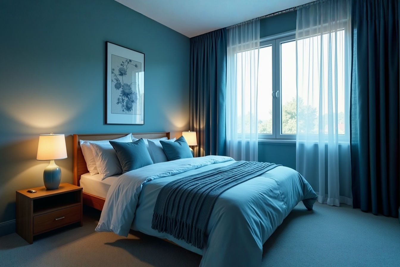
- Deep Navy and Indigo: Moving to the darker end of the spectrum, navy and indigo blues create a sense of depth, coziness, and sophistication. These colors can make a large room feel more intimate and enveloping, like a peaceful night sky. While darker, they still retain blue’s calming essence, offering a feeling of security and retreat. They absorb light, making them excellent choices for creating a moody, restful sanctuary that encourages deep sleep.
- Dusty or Grey-Blues: These blues are mixed with grey, resulting in a more subdued and sophisticated tone. Dusty blues feel soft and understated, offering a sense of quiet elegance. Grey-blues are particularly versatile, acting almost as a neutral while still providing the calming benefits of blue. They are less intense than pure blues and can create a very serene, almost minimalist feel. These shades are excellent for creating a timeless and tranquil space that isn’t overly saturated with color.
Understanding how these different shades influence the atmosphere is the first step in choosing the perfect blue for your master bedroom retreat.
Choosing the Right Blue Paint Color
The paint color on your walls is arguably the most impactful decision you’ll make when decorating. It sets the overall tone and mood for the entire room. When aiming for a calming blue master bedroom, selecting the right shade of paint is paramount.
Soft Sky Blues: Airy and Light
If you want your master bedroom to feel bright, open, and airy, soft sky blues are an excellent choice. These are light shades, often with a hint of grey or white mixed in, that mimic the color of a clear daytime sky. Think of colors like powder blue, baby blue, or a very pale cerulean.
Technically, these colors have a high light reflectance value (LRV), meaning they reflect a significant amount of light rather than absorbing it. This is why they make rooms feel brighter and more spacious. They are particularly effective in smaller bedrooms or rooms that don’t receive a lot of natural light, as they help maximize the available illumination.
Using soft sky blue on all four walls can create a feeling of being enveloped in a gentle, calming atmosphere. It’s a color that feels optimistic and refreshing, perfect for waking up feeling rested. You can pair it with crisp white trim for a clean, classic look or with soft greys and natural wood tones for a more relaxed, Scandinavian-inspired feel.
Muted Teal and Aqua: Depth and Nature’s Touch
For a slightly richer, more complex calming blue, consider muted teal or aqua. These colors sit on the spectrum between blue and green, bringing in the restorative qualities of nature. Teal is generally a deeper, more saturated blue-green, while aqua is lighter and brighter, often leaning a bit more towards green. When we talk about muted versions, we mean they have a touch of grey or brown added, which softens their intensity and makes them feel more sophisticated and less vibrant.
These shades evoke images of calm ocean waters or the subtle blue-green hues found in natural landscapes. The addition of green subtly connects the space to the natural world, which is known to have a calming effect. Muted teal can create a cozy, enveloping feel, especially in a larger room, while muted aqua can feel fresh and rejuvenating.
Technically, the hue of these colors falls between blue and green on the color wheel. Their saturation (intensity) is reduced by the addition of grey, making them less stimulating than their pure, vibrant counterparts. This lower saturation is key to their calming effect in a bedroom. They pair beautifully with natural materials like wood, rattan, and linen, enhancing their connection to nature. Warm metallic accents like brass or gold can add a touch of elegance against these earthy blue-greens.
Deep Navy and Indigo: Cozy Sanctuary
If your vision for a calming master bedroom involves a sense of intimacy, depth, and sophisticated drama, deep navy or indigo blue paint is a superb choice. These are dark, saturated blues that create a feeling of being cocooned in a peaceful, starry night sky. Navy is a very dark shade of blue, often close to black, while indigo is a rich, deep blue with a hint of purple.
Painting a bedroom in a deep blue might seem counterintuitive for calmness to some, but the effect can be incredibly soothing. Dark colors absorb light, which can make a room feel smaller but also more intimate and secure. It creates a backdrop that minimizes distractions and encourages the mind to settle down, making it ideal for promoting deep sleep.
Technically, these colors have a very low LRV, meaning they absorb most of the light that hits them. This creates a sense of depth and can make other elements in the room, like artwork or lighter furniture, stand out. To prevent the room from feeling too dark or heavy, it’s essential to balance deep blue walls with lighter elements. Consider using white or light grey trim, incorporating plenty of lighter textiles (bedding, rugs), and ensuring you have ample layered lighting. Warm-toned lighting is particularly important with deep blues, as it prevents the color from feeling cold. Deep blues pair well with warm wood tones, rich leather, and metallic accents like copper or bronze.
Dusty or Grey-Blues: Sophisticated Serenity
For a calming blue that feels effortlessly chic and versatile, explore dusty or grey-blues. These shades are created by mixing blue with a significant amount of grey. The result is a color that is soft, muted, and incredibly serene. Dusty blues often have a slightly faded or vintage quality, while grey-blues can range from cool, steely tones to warmer, almost greige-like variations with a blue undertone.
These colors offer the calming benefits of blue without being overly vibrant or intense. The grey component neutralizes some of the blue’s coolness, making them feel more grounded and sophisticated. They act almost like a neutral color, providing a subtle backdrop that pairs well with a wide range of other colors and materials.
Technically, these colors have a lower saturation than pure blues due to the addition of grey pigment. Their LRV can vary depending on how light or dark the specific shade is. Dusty blues often have a medium LRV, making them suitable for most rooms, while darker grey-blues will have a lower LRV. These shades are incredibly versatile and can be used in various design styles, from modern minimalist to traditional. They pair beautifully with other neutrals like white, cream, beige, and charcoal. Adding textures through textiles and natural materials enhances the sophisticated serenity of a grey-blue room.
Layering Blue Through Textiles
While paint sets the stage, textiles are where you can truly layer in different shades and textures of blue to create a cozy, inviting, and calming atmosphere. Using blue in bedding, rugs, curtains, and throws adds softness, warmth, and visual interest without requiring a major commitment like painting walls.
Bedding: Your Blue Cloud
Your bed is the focal point of the master bedroom, and the bedding you choose plays a huge role in both comfort and aesthetics. Layering blue through bedding allows you to incorporate multiple shades and textures, creating a dynamic yet calming look.
Start with a base layer like sheets in a soft, light blue or crisp white. Then, choose a duvet cover or comforter in a complementary blue shade. This could be a muted teal, a dusty blue, or even a deep navy for a bolder statement. Layering pillows is key to creating that plush, inviting look. Mix and match shams in different blue tones and textures – think solid blue linen, patterned blue cotton, or velvet in a deep indigo. Add a few accent pillows in a complementary color like soft grey, warm beige, or even a subtle metallic gold for a touch of glamour. The variety in shades and textures prevents the look from being monotonous while reinforcing the calming blue theme.
Technically, different fabric types will absorb and reflect light differently, affecting how the blue color appears. A matte cotton duvet will look different from a sateen finish or a textured linen. Using a mix of finishes adds visual depth. The weave of the fabric also impacts texture – a chunky knit throw feels different and looks different from a smooth silk pillowcase.
Rugs: Grounding the Space
A rug can anchor your furniture arrangement and add a significant layer of color and texture to the room. In a blue master bedroom, a rug offers an opportunity to introduce another shade of blue or a pattern that incorporates blue.
Consider a large area rug that extends under the bed and nightstands. A solid rug in a calming blue shade, like a muted grey-blue or a soft aqua, can provide a serene foundation. Alternatively, a rug with a pattern that features blue can add visual interest. This could be a subtle geometric pattern in varying shades of blue and white, a traditional Persian-style rug with intricate blue motifs, or a modern abstract design.
Rugs also add a layer of softness underfoot, contributing to the overall feeling of comfort and calm. The material of the rug matters too – a plush wool rug feels luxurious and warm, while a natural fiber rug like jute or sisal can add an earthy, grounding element that pairs well with blue.
Technically, the pile height and material of the rug affect its texture and how it interacts with light. A high-pile rug will absorb more light and feel cozier, while a low-pile or flat-weave rug will reflect more light and have a crisper appearance.
Curtains: Softness and Light Control
Curtains are essential for privacy and light control in a bedroom, but they also offer a large surface area to introduce color and softness. Choosing curtains in a calming blue shade can enhance the serene atmosphere and frame your windows beautifully.
Opt for fabrics that drape well, such as linen, cotton, or velvet. The weight and opacity of the fabric will determine how much light is filtered or blocked. For a light and airy feel, choose sheer or semi-sheer blue curtains that allow natural light to filter through softly. For a cozier, more private sanctuary, opt for blackout or room-darkening curtains in a deeper blue shade like navy or indigo.
The color of the curtains should complement your wall color and bedding. If your walls are a light blue, consider curtains in a slightly darker blue or a blue with a subtle pattern. If your walls are a deep blue, lighter blue or patterned curtains can provide contrast and prevent the room from feeling too dark.
Technically, the weave and finish of the curtain fabric affect its light-filtering properties and drape. A tight weave will block more light than a loose weave. Fabrics with a slight sheen, like velvet or sateen, will reflect more light than matte fabrics like linen or cotton.
Throws and Blankets: Cozy Layers
Finally, add throws and blankets to your bed or a nearby chair for extra layers of comfort and a touch of effortless style. These smaller textile elements are perfect for introducing pops of different blue shades or textures.
A chunky knit throw in a soft grey-blue draped over the corner of the bed adds a tactile element and invites you to snuggle up. A velvet throw in a rich teal or indigo can add a touch of luxury. You can also use patterned blankets that incorporate blue, like a classic plaid or a modern geometric design.
Throws and blankets are easy to swap out, allowing you to change the look and feel of your room seasonally or whenever you crave a refresh. They contribute to the overall feeling of coziness and make the bedroom feel more inviting and lived-in.
Technically, the material and construction of the throw or blanket determine its warmth and texture. Natural fibers like wool and cotton are breathable and comfortable, while synthetic fibers like polyester can be very soft and durable. The knit or weave pattern also adds visual and tactile texture.
Incorporating Blue Furniture and Accents
Beyond paint and textiles, you can weave blue into your master bedroom through furniture pieces and decorative accents. These elements can serve as focal points or subtle touches that reinforce the calming blue theme.
Upholstered Headboards or Chairs: Statement Pieces
An upholstered headboard is a fantastic way to introduce a significant amount of blue into the room while also adding a layer of softness and luxury to your bed. Choose a headboard upholstered in a calming blue fabric – this could be a soft linen in a dusty blue, a plush velvet in a deep navy, or a textured fabric in a muted teal. The headboard becomes a comfortable backrest and a stylish statement piece.
Similarly, an upholstered accent chair in a corner of the room can create a cozy reading nook and add another touch of blue. A chair in a rich blue velvet or a patterned blue fabric can provide a beautiful contrast to the wall color and other furniture.
Technically, the type of upholstery fabric affects durability, feel, and appearance. Natural fibers like cotton and linen are breathable but can wrinkle, while synthetic fibers like polyester and rayon are often more durable and stain-resistant. Velvet has a distinct pile that reflects light differently, creating a rich, luxurious look.
Dressers or Nightstands: Painted or Stained Blue
If you’re feeling a bit more adventurous or want to add a unique touch, consider incorporating furniture pieces that are painted or stained blue. A dresser or nightstand in a calming blue shade can add a pop of color and personality to the room.
You can find furniture that is already finished in blue, or you can refinish an existing piece yourself. Painting a dresser in a soft grey-blue or a muted teal can transform it into a charming focal point. For a more sophisticated look, consider staining a wood piece with a blue-toned stain that allows the wood grain to show through.
Technically, the type of paint or stain used will affect the finish and durability of the furniture. Chalk paint can create a matte, slightly distressed look, while a satin or semi-gloss finish will be more durable and easier to clean. Wood stain penetrates the wood, coloring it while allowing the natural texture to remain visible.
Decorative Objects: Subtle Blue Touches
For a less permanent or more subtle way to incorporate blue, focus on decorative objects and accessories. These smaller items can be easily changed out and allow you to experiment with different shades and patterns of blue.
Think about adding blue vases to your dresser or nightstand, placing blue-toned lamps on your bedside tables, or hanging artwork that features calming blue landscapes or abstract designs. Decorative pillows on the bed or an accent chair, blue picture frames, or even a collection of blue-tinted glass bottles can add touches of the color throughout the room.
These smaller elements allow you to distribute blue throughout the space, creating a cohesive look without overwhelming the room. They are also an opportunity to introduce different textures and materials, like ceramic vases, glass lamps, or framed prints.
Technically, the material and finish of these objects affect how they interact with light and their visual weight in the room. A glossy ceramic vase will reflect light and feel more modern, while a matte finish will absorb light and feel more understated.
Pairing Blue with Complementary Colors
While blue is the star of your calming master bedroom, the colors you pair with it are equally important in creating a balanced and harmonious space. Choosing the right complementary colors can enhance the calming effect of blue and add depth and interest to the room.
Neutrals: Classic Serenity
You can’t go wrong pairing blue with classic neutrals like white, grey, and beige. These colors provide a clean, serene backdrop that allows the blue to stand out while keeping the overall atmosphere calm and balanced.
- White: Crisp white trim, bedding, or accessories create a fresh, airy feel when paired with any shade of blue. It provides a clean contrast that makes the blue feel brighter and more vibrant.
- Grey: Grey and blue are a natural pairing, both being cool, calming colors. A grey-blue color palette is inherently serene and sophisticated. You can use grey on walls, in textiles like rugs or bedding, or in furniture.
- Beige/Cream: Warm neutrals like beige and cream add a touch of warmth and softness that balances the coolness of blue. They create a cozy, inviting feel and pair particularly well with muted or dusty blues.
Technically, neutrals have very low color saturation and are defined by their lightness or darkness (value). They provide a visual resting place for the eye and allow saturated colors like blue to be appreciated without competition.
Warm Metals: Elegant Accents
Adding touches of warm metals like gold, brass, or copper can introduce a subtle touch of elegance and warmth to a blue bedroom. These metallic accents catch the light and add a hint of glamour without being overly flashy.
Think about using gold or brass hardware on furniture, a metallic lamp base, a decorative mirror with a gold frame, or accent pillows with metallic threads. These small touches can elevate the look of the room and provide a lovely contrast to the cool tones of blue.
Technically, the reflectivity of metallic surfaces creates highlights that draw the eye. Warm-toned metals like gold and brass have a yellow or reddish undertone that provides a pleasing contrast to the cool undertones of blue.
Wood Tones: Natural Warmth
Natural wood tones are an excellent way to add warmth, texture, and a connection to nature in a blue master bedroom. The rich, organic quality of wood provides a beautiful balance to the cool, calming nature of blue.
Consider using wood furniture like a bed frame, dresser, or nightstands. The type of wood and its finish will impact the overall feel. Light woods like maple or oak can contribute to an airy, Scandinavian-inspired look, while darker woods like walnut or mahogany can add a sense of richness and sophistication. Incorporating smaller wood elements like picture frames, decorative bowls, or a wooden bench at the foot of the bed also adds warmth.
Technically, wood has a natural grain and texture that adds visual interest. The color of the wood comes from pigments and tannins within the wood itself. The finish (stain, varnish, oil) can alter the color and protect the wood.
Touches of Green: Connecting to Nature
Introducing living plants or botanical prints is a simple yet effective way to add touches of green to your blue bedroom. Green is another color associated with nature and tranquility, and it pairs beautifully with blue, enhancing the calming, organic feel of the space.
Place potted plants on windowsills, nightstands, or dressers. Choose plants with lush green foliage that thrive in indoor environments. You can also incorporate botanical artwork or textiles with leaf or floral patterns that feature green.
Technically, the green color in plants comes from chlorophyll, the pigment responsible for photosynthesis. Introducing plants also improves air quality, contributing to a healthier and more calming environment.
Subtle Pops of Contrast: Adding Visual Interest
While the goal is calmness, adding very subtle pops of a contrasting color can prevent the room from feeling monotonous and add a touch of visual interest. The key is to use these contrasting colors sparingly and in muted tones so they don’t disrupt the overall serene atmosphere.
Consider using small accents in colors like soft coral, muted terracotta, or a gentle blush pink. These warm colors are opposite blue on the color wheel (complementary colors), creating a pleasing contrast. Use them in small doses, such as in a decorative pillow, a piece of artwork, or a small vase. The contrast draws the eye and adds a layer of sophistication without being jarring.
Technically, complementary colors, when placed next to each other, make each other appear more vibrant. However, by using muted or desaturated versions of the contrasting color, you can achieve this visual interest without creating a stimulating effect.
Lighting for a Blue Bedroom
Lighting plays a critical role in setting the mood of any room, and in a calming blue master bedroom, it’s essential to choose lighting that enhances the serene atmosphere. The right lighting can make your blue walls feel warm and inviting rather than cold or sterile.
Soft, Layered Lighting
Relying on a single overhead light fixture is rarely ideal for creating a calming bedroom environment. Instead, aim for layered lighting, which involves using multiple light sources at different levels to create depth and flexibility.
Combine ambient lighting (the main, general light source, like a ceiling fixture or recessed lighting) with task lighting (for specific activities, like bedside lamps for reading) and accent lighting (to highlight features, like a small lamp on a dresser or picture lights). Using dimmers on your lights allows you to adjust the brightness to suit your mood and the time of day, creating a softer, more relaxed ambiance in the evenings.
Technically, layered lighting provides a more even distribution of light throughout the room, reducing harsh shadows and creating a more comfortable visual environment. Using multiple light sources also allows for greater control over the mood and functionality of the space.
Warm vs. Cool Bulbs
The color temperature of your light bulbs significantly impacts how colors appear in your room and the overall feeling of the space. Light bulbs are measured in Kelvin (K), which indicates their color temperature.
- Cool white light (4000K and above): This light has a bluer tone and can feel stark and less inviting, similar to office lighting.
- Warm white light (2700K – 3000K): This light has a more yellowish tone, similar to incandescent bulbs. It creates a cozy, warm, and inviting atmosphere.
For a calming blue master bedroom, it’s crucial to use warm white light bulbs (around 2700K to 3000K). This warmer light will prevent blue walls from looking cold or sterile and will enhance the feeling of coziness and relaxation. Avoid cool white or daylight bulbs, as they can make blue appear harsher and less calming.
Technically, the Kelvin temperature rating refers to the correlated color temperature (CCT) of the light source. A lower Kelvin number indicates a warmer, more yellow light, while a higher number indicates a cooler, bluer light.
Natural Light: Maximizing and Filtering
Natural light is the best kind of light for any room, and maximizing its presence in your blue master bedroom is important for creating a bright and airy feel during the day. Position furniture to avoid blocking windows and keep window treatments open during the day.
However, direct, harsh sunlight can sometimes be too bright. Use sheer or semi-sheer blue curtains (as discussed in the textiles section) or blinds to filter natural light, softening it and diffusing it throughout the room. This creates a gentle, even illumination that enhances the calming effect of the blue decor.
Technically, natural light has a very high color rendering index (CRI), meaning it accurately represents the true colors of objects. Filtering natural light reduces its intensity and can help create a more uniform illumination, minimizing harsh shadows and glare.
Creating a Blue-Themed Sanctuary
Beyond simply using blue, you can create a specific theme within your blue master bedroom to enhance the calming atmosphere and give the space a distinct personality. Here are a few ideas for blue-themed sanctuaries:
Coastal Calm: Light and Breezy
A coastal-themed blue bedroom evokes the feeling of a peaceful seaside retreat. This theme typically uses light, airy blues paired with crisp whites and natural textures.
Think of soft sky blue walls, white or light grey furniture, and bedding in varying shades of blue and white, perhaps with subtle stripe or wave patterns. Incorporate natural materials like driftwood, rattan, jute, and linen. Decorative elements could include seashells, nautical-inspired artwork, and glass bottles in blue or green tones. The overall feel is light, breezy, and refreshing, like a day spent by the ocean.
Technically, this theme relies on a high-key color palette (using light colors) and textures that mimic natural elements found near the coast. The use of natural materials adds an organic feel and connects the space to the outdoors.
Moody Retreat: Deep and Enveloping
For a more dramatic and intimate calming space, create a moody blue retreat using deep blues like navy or indigo. This theme is about creating a sense of being enveloped in a cozy, sophisticated sanctuary.
Paint walls in a deep blue, and layer the space with rich textures. Think velvet bedding and curtains, chunky knit throws, and a plush rug. Incorporate warm wood tones and metallic accents in gold or brass to add richness and contrast. Lighting is crucial here – use warm, low-level lighting from bedside lamps and accent lights to create a soft, inviting glow. Artwork can be moody landscapes or abstract pieces with deep colors.
Technically, this theme uses a low-key color palette (using dark colors) and relies heavily on texture and layered lighting to create depth and atmosphere. The use of rich materials like velvet adds a sense of luxury and comfort.
Modern Minimalist: Clean and Serene
If your style is more contemporary, you can create a calming blue master bedroom with a modern minimalist approach. This theme focuses on clean lines, a limited color palette, and a focus on texture and form.
Choose a single calming blue shade, such as a dusty blue or a muted grey-blue, for the walls or a key piece of furniture. Keep the rest of the color palette simple with neutrals like white, black, and grey. Furniture should have clean, uncluttered lines. Focus on texture through materials like linen bedding, a textured rug, or a concrete lamp base. Decorative elements should be minimal and carefully chosen, such as a single piece of abstract art or a few sculptural objects. The goal is to create a serene, uncluttered space that promotes mental clarity.
Technically, this theme emphasizes simplicity in form and color. The use of a limited color palette and clean lines creates a sense of order and spaciousness. Texture is used to add visual interest without introducing additional colors or patterns.
Practical Tips for Decorating with Blue
As you embark on decorating your calming blue master bedroom, keep these practical tips in mind to ensure a successful and stress-free process.
Start Small: Introduce Blue with Accessories
If you’re hesitant about committing to blue walls or large blue furniture pieces, start small. Introduce blue through accessories like decorative pillows, throws, vases, lamps, or artwork. This allows you to see how different shades of blue look in your space and how they make you feel before making bigger changes. Accessories are also easy and relatively inexpensive to swap out if you decide you want to try a different shade or direction.
This approach is technically low-risk and allows for iterative design. By introducing smaller elements first, you can assess the impact of the color in your specific lighting conditions and with your existing furniture before investing in larger items or paint.
Test Paint Samples: See How Colors Look
Paint colors can look dramatically different on a small swatch in a store compared to how they appear on your walls in your home’s unique lighting conditions. Before committing to a paint color, purchase several sample pots of the shades you are considering.
Paint large swatches (at least 1 foot by 1 foot) of each color on different walls in your bedroom. Observe how the colors look at different times of the day – in natural light, under artificial light, in the morning, and in the evening. This is the most crucial step in choosing the right paint color, as it ensures you’ll be happy with the final result.
Technically, the appearance of paint color is affected by the light source’s color temperature (as discussed earlier), the amount of light, and the surrounding colors in the room. Testing samples in situ accounts for these variables.
Balance is Key: Avoid Overwhelming the Room
While you want to create a blue-themed bedroom, avoid using too much blue, especially in saturated or dark shades, as this can make the room feel overwhelming or even cold rather than calming. Balance is key to creating a serene space.
If your walls are a deep blue, balance them with lighter colors in your bedding, furniture, and accessories. If you’re using a lot of blue textiles, consider keeping the walls a neutral color like white or light grey. Mix different shades of blue and incorporate complementary colors and textures to create visual interest and prevent the space from feeling monotonous.
Technically, the principle of visual weight applies here. Too much of a single, dominant color can make the space feel heavy or unbalanced. Distributing the color through different elements and varying its intensity (lightness/darkness) and saturation creates a more harmonious composition.
Consider the Room’s Size and Light
Always consider the size of your master bedroom and the amount of natural light it receives when choosing blue shades.
- Smaller or Darker Rooms: Lighter shades of blue, like soft sky blue or pale grey-blue, are generally better for smaller or darker rooms. Their higher LRV will help the room feel brighter and more spacious by reflecting more light.
- Larger or Brighter Rooms: You have more flexibility in larger or brighter rooms and can comfortably use deeper shades like navy, indigo, or muted teal without making the room feel dark or cramped. The ample natural light will prevent these deeper colors from feeling too heavy.
Technically, the amount of light in a room directly impacts how colors are perceived. In low light, colors appear darker and less saturated. In bright light, colors appear lighter and more vibrant. Choosing colors based on the room’s inherent light conditions ensures the color appears as intended.
Bringing it All Together: Your Calming Blue Haven
Creating a calming blue master bedroom is about more than just picking a color; it’s about intentionally designing a space that promotes relaxation, rest, and well-being. By thoughtfully incorporating blue through paint, textiles, furniture, lighting, and accents, you can transform your bedroom into a true sanctuary.
We’ve explored nine key ideas, from understanding the psychological impact of different blue shades to layering the color through various elements and pairing it with complementary tones. Whether you prefer the airy feel of a coastal retreat, the cozy intimacy of a moody sanctuary, or the clean simplicity of a modern minimalist space, blue offers a versatile palette for creating a calming atmosphere.
Remember to test paint samples, balance your use of blue with other colors and textures, and consider the unique characteristics of your room, such as its size and natural light. Most importantly, personalize the space to reflect your own style and preferences. Your master bedroom should be a reflection of you and a place where you feel most at ease.
By following these ideas and tips, you’re well on your way to creating a beautiful and calming blue master bedroom that you’ll love retreating to at the end of each day.
Conclusion
In conclusion, blue is a powerful color for promoting calmness and tranquility, making it an ideal choice for a master bedroom. By strategically using different shades of blue in combination with thoughtful lighting, complementary colors, and varied textures, you can create a serene and inviting space that supports rest and relaxation. Embrace the calming potential of blue and design the peaceful haven you deserve.